Kinetic Text | God's Away on Business

It's done! My kinetic text project is officially complete. So here it is!
Please do click through to see the complete process, from start to finish!
This project ran throughout the second semester of my second year in LSAD, Clonmel, studying Digital Animation Production; from January until May 2015. The project was part of the Video I module, taught by Michael Kiely. We were given a brief to produce a piece of kinetic text, together with list of songs which we could choose from. Eventually, I decided to work with God’s Away on Business by Tom Waits. I picked it for a number of reasons; I liked it, it has a good, solid beat, it stood out to me as quirky and interesting immediately, and it had a lot of visual appeal to me.

The first step was planning out my shots and how they would transition from one to the next. I had two major concerns; one was that they viewer wouldn’t have enough time to read the words as they appeared, and the other was that the shots would appear as separate pieces, rather than as one, comprehensive, unified production. The first problem was partially solved with my song choice, whereas the second one was more challenging, especially because I was very unfamiliar, and really lacking confidence with After Effects. For that reason, I was very careful with my planning so that I was completely certain about how I wanted everything to look, and I could focus entirely on learning how to use the software to achieve that.

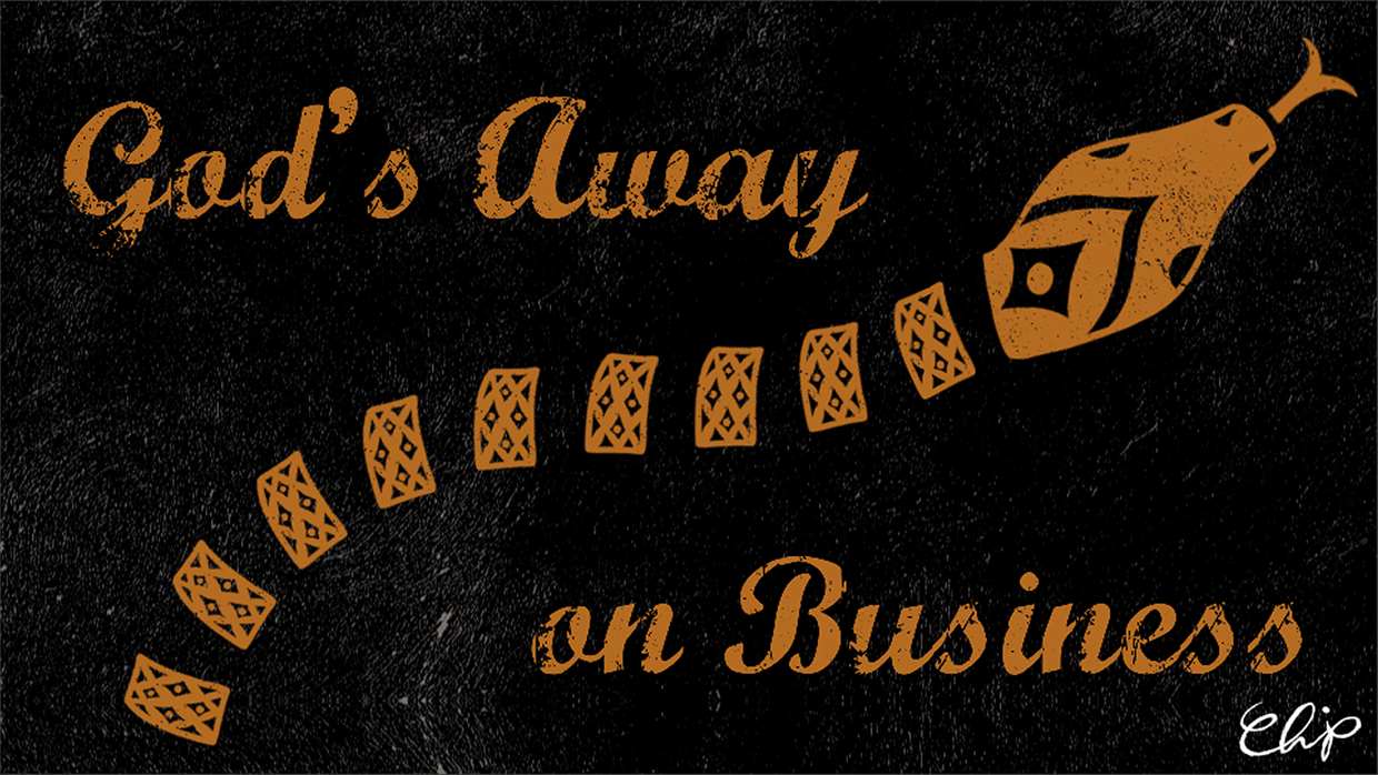
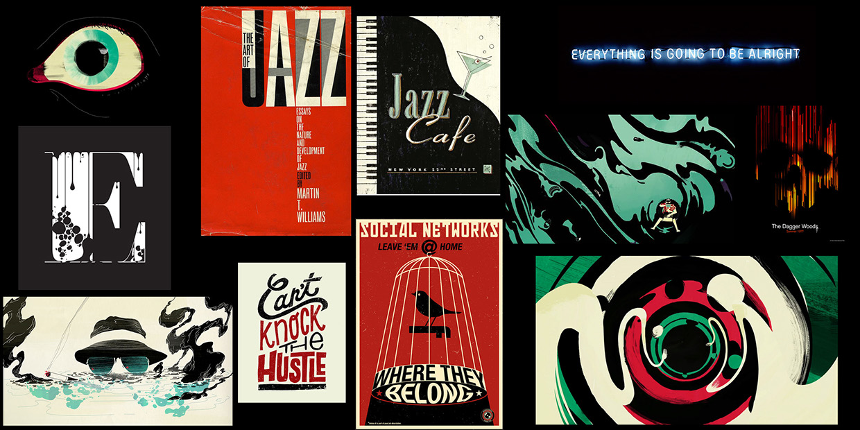
From there, I moved on to creating style sheets. As soon as I heard the song, I had a very clear image of how I wanted it to look. God’s Away on Business is a dark, gritty, textured kind of sound, with a steady chugging beat, and a slightly old-fashioned feel. So those were the factors that I wanted to try to capture. I used highly graphic visuals, strong colours, and slid text, all wrapped up with a slightly grunge-inspired texture.

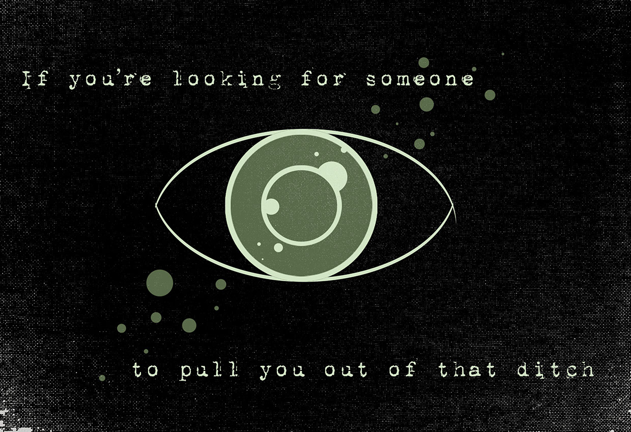
With those style sheets in mind, I started drawing up style frames. The opening few lines were the first test shots I created, all the time bearing in mind that I would need to keep certain elements of the designs separate, so that I would be able to animate them as I imagined and planned.
Once I had those files set up and ready to animate, I ran a short proof of concept. I took out a lot of the textures, mostly because I wasn’t sure of my footing in After Effects. And at that stage, I was becoming very, very nervous. That twenty-second proof of concept took three or four complete re-starts until I figured out what I needed to do. I spent long, frustrating days on it, only to close the program without saving because I wasn’t happy with the results. Eventually, something clicked and it all made sense to me. Compositions in compositions in compositions. It was a bit of a eureka moment. And after that, I felt a whole lot more confident.
From that point onwards, I worked shot by shot, verse by verse. I brought back all the textures, and spent the next few weeks playing with the project. It very, very quickly became my favourite project of the semester. Whenever I got too stressed out or frustrated with other assignments, I’d work on a shot or two here and there to relax. It was a lot of fun, and I felt like I knew what I was doing. It felt really, really good to be working on my own, inching closer and closer to completion all the time. It helped that I liked how it was turning out and I really couldn’t wait to see the whole thing finished too.
Because I had worked shot-by-shot, as I got closer to the deadline I reached a happy point of being finished to a level I was happy with, but also having time to go back and add extra details wherever they were appropriate. At this stage in particular, talking to others was incredibly helpful. Conversations, suggestions, and help with software, certainly influenced the overall product for the better. There were some things that I just wouldn’t have thought of, or wouldn’t have known how to do, if I hadn’t talked to friends, family, and my lecturer about the project.
As a lover of graphic design, typography, animation, and sound, kinetic text is something that very much appeals to me, and as a lover of things that are quirky, weird, and a little bit wonky, I am really, really glad that I could use this song to try it out. Overall, I am very, very happy with the end result. I had a lot of fun doing it, and I felt like I learned a lot from the experience.