Graphic Design / Looptown Logo
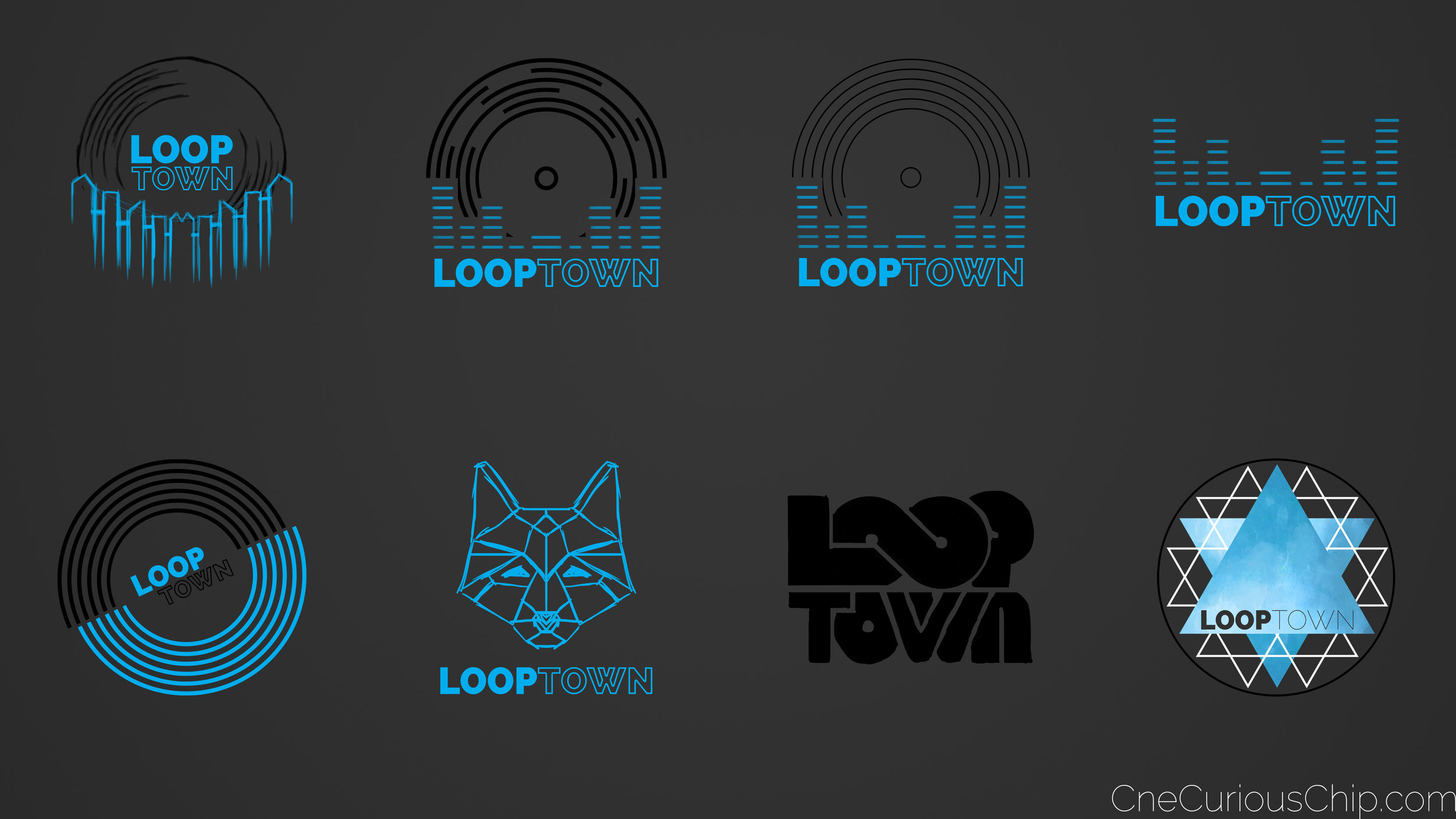
Recently, I was asked to design a logo for a local DJ group called LoopTown. Dealing mostly with late teen audiences and house music, I had some fun playing around with styles and symbols that I thought would resonate with that audience. I wanted to create something fresh and distinctive for the group, mixing between simplicity and complexity to create an image they could build a brand on.
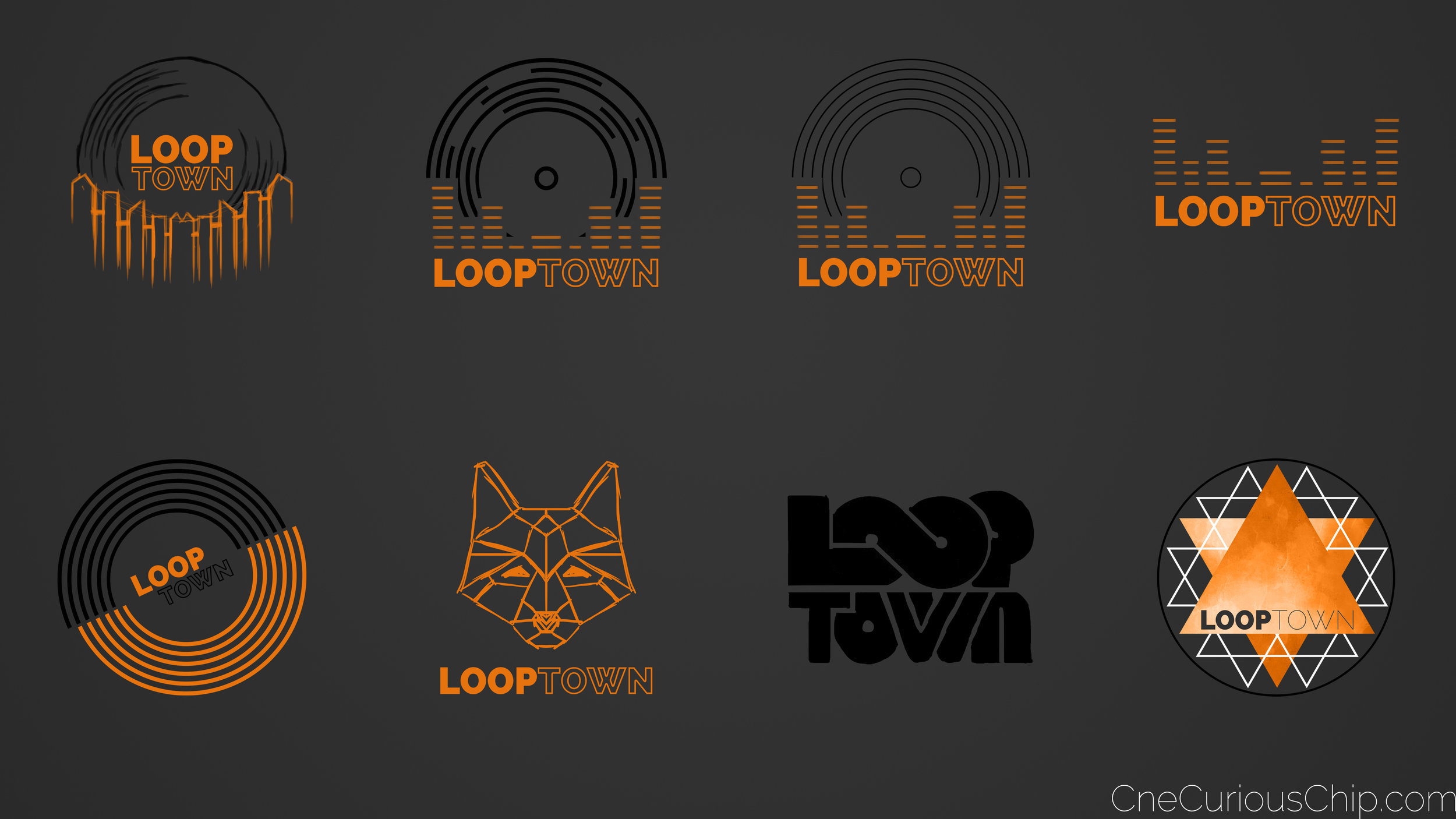
You can see some of my mock-ups above. I was heavily influenced by vinyl records, music visualizers, geometric patterns, looping typography, and cityscapes. I tried out two colour variations as well, knowing that the guys in LoopTown liked black, blue, and orange.
A few iterations later, and the final decision was made to go ahead with the version on the left, above. I'm pretty happy with how it turned out! What do you think?

